Between Sky and Sea: The Blues of the Artist’s Canvas

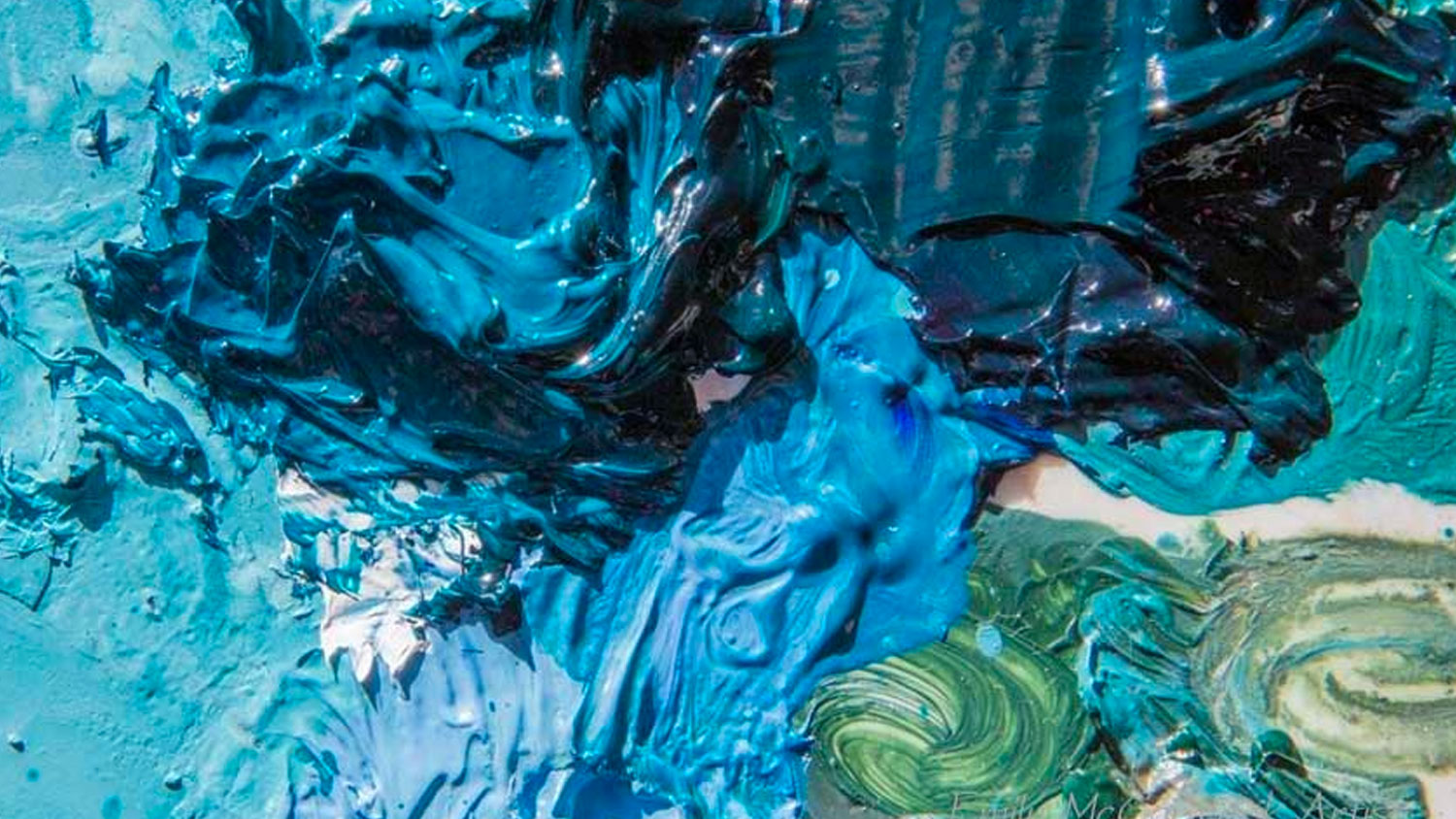
Blue, with its vast range of hues, has always been a captivating color for artists throughout history. Its versatility and depth evoke myriad emotions, from the calmness of a cerulean sky to the melancholy of a stormy sea. As an artist, I’ve had the privilege of playing with various shades of blue, each bringing its own unique character to a canvas. Let’s embark on a journey to explore some of the most commonly used blue colors by artists and delve into the distinct qualities of each.

  1. Ultramarine Blue: Derived from the Latin ‘ultramarinus’, which means ‘beyond the sea’, Ultramarine was originally made by grinding the precious stone lapis lazuli. It’s a deep, brilliant blue that leans slightly towards violet. Ideal for depicting depth in skies or seas, its richness adds depth and contrast, making it a favorite among many artists, including myself.
  2. Cerulean Blue: This is the blue of clear daytime skies. A crisp, fresh color, Cerulean is slightly greenish-blue and has a certain transparency that makes it perfect for painting atmospheric effects and achieving a sense of space in landscapes.
  3. Phthalo Blue: A relatively modern pigment, Phthalo Blue has a strong staining quality and is incredibly vibrant. Its intensity can dominate other colors, so I use it judiciously. However, its high tinting strength can produce a vast range of shades when mixed, making it invaluable for producing vibrant ocean scenes or night skies.
  4. Cobalt Blue: A staple in an artist’s palette, Cobalt Blue offers a moderate tinting strength, falling somewhere between Ultramarine and Cerulean. Historically appreciated for its stability and uniformity, it’s a perfect choice for artists who want a pure, middle-of-the-road blue without the overpowering qualities of some modern pigments.
  5. Prussian Blue: This is one of the first synthetic pigments, and its discovery revolutionized the artist’s palette in the 18th century. A deep blue that veers towards green, Prussian Blue is valued for its intense coloration and tinting ability. Its darker shades can be almost black, making it great for adding depth and shadows.


Each blue has its charm, its strengths, and its ideal scenarios where it shines the brightest. As with all things in art, the beauty of these pigments lies not just in their individual characteristics, but in how they interact with other colors, how they layer, blend, and contrast.

In my own work, whether it’s a Smoky Mountains vista, a scene from the heart of North America, or a captivating black bear in deep snow, the choice of blue forms the emotional core of the piece. The sky, the water, the hint of blue in shadows – they all echo the sentiment I want to convey.

To all budding artists and art enthusiasts, I encourage you to explore these blues. Play with them, mix them, and watch the magic unfold on your canvas. After all, in the vast spectrum of artistic expression, blue is not just a color; it’s an emotion.